Gin Label Design – New Archie Rose LE Sunrise Lime
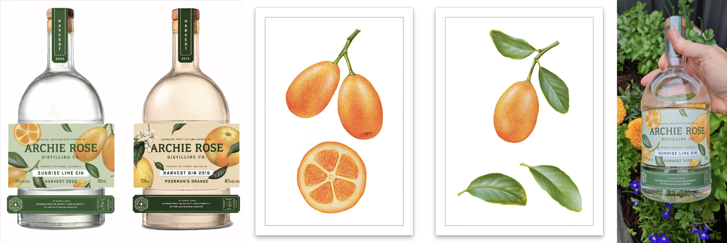
I am super excited to see another of my recent projects come full circle this week with the new Archie Rose limited edition Sunrise Lime GIN bottles hitting the shelves, adorned with my citrus botanical illustrations / artwork once again. Last year we created a beautiful, elegant botanical design for the LE Poorman’s Orange flavour and with this sold out, we have a new flavour available in the Sunrise Lime. Another great project, another great result… more fun to share with you all! You may recall me working on these citrus illustrations earlier in the year. I started to share the progress with you but we decided to hold off until the launch. Today I am finally able to share the end results with you.
looking back at the illustrations
The Archie Rose team commissioned me to produce a series of new illustrations to feature on their new gin labels earlier this year. Following the Poormans Orange series, we shifted our focus to a new citrus subject and flavour. We wanted to keep this range in the same vein as last years design, but with its very own look and feel. In the end we decided to change mediums from watercolour to acrylics to create an intense, vibrant and luxurious finish to the illustrations. This change of medium offered up its own uniqueness whilst maintaining many of the similarities I have across the board in my work.
I loved the shift and jumped right in to the challenge. Working in rich, intense pigments, orange and yellow textural fruits with lush green leaves I created a series of individual beautiful, realistic artworks that captured the essence of the subject, the gin and Archie Roses own styling. 3 full fruits, leaves, branches and stems as well as a luscious cross section of the fruit completed the series… a nice collection of related elements to play with in the final design.
My approach for these projects was to create a series of individual element illustrations of our citrus subjects. This approach meant that the graphic designers had vastly more scope and options of how these could be used in the label application. It has worked very well. Beyond my hands, the designers were able to place the illustrations nicely then fine tune the design to the final product, tweaking the size, placement, text and other features to get the layout just right… and it looks great.
Above you can see the original artworks, the mock ups of the end product and finally the completed sunrise lime gin bottle from the Archie Rose distillery to my hand, my favourite part. I do LOVE a good gin!
coming up
As we speak, I am amidst the illustration process for the next Archie Rose gin release. Of course youll have to wait and see what we come up with next but I can tell you its going to look and taste amazing! These things take time, lots of time behind the scenes to bring to fruition. Its a process of many hands and minds on deck, expertise of many kinds, a handful of visionaries, creatives and doers with a splash of time and hard work in the mix too… but were onto it and its a pleasure to be a part of a team who are all as passionate and committed to their part as you are for yours. So ill be back with more news on the new bottle in due course but in the meantime, see if you can grab a bottle of Archie Roses new Sunrise Lime gin before it too sells out and have a cheers to me along the way.
********************************************************
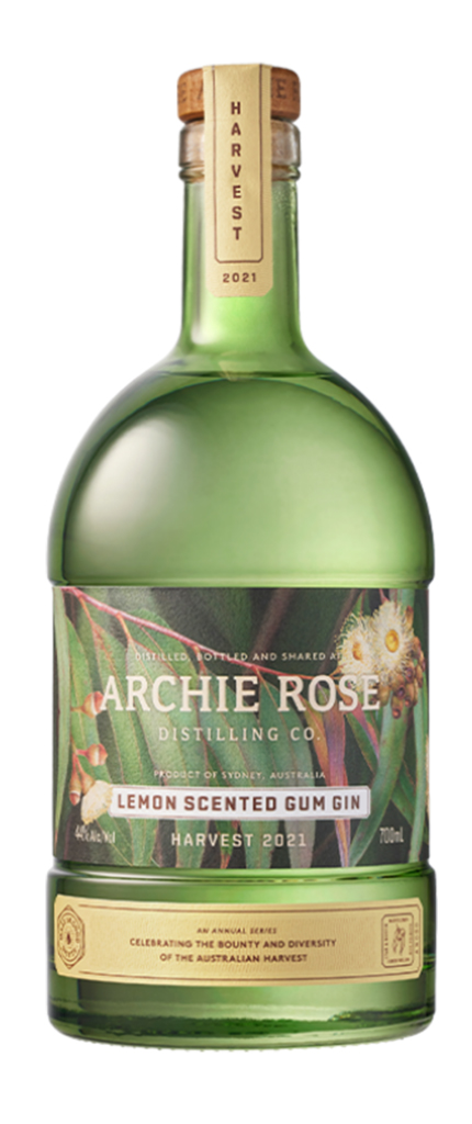
Update – The new Archie Rose Lemon Scented Gum Gin is now available! Heres the finished product
********************************************************
Thanks for following and enjoy