Orange Illustrations – Archie Rose LE Gin Label – Watercolour
My latest project is another exciting one for me, creating a series of Poorman’s Orange illustrations for the new Archie Rose LE Gin range. Earthy, vibrant, organic, with subtle blemish punctuations so typical of this citrus variety, keeping the label interesting, diverse and luscious is the goal for each fruit study. Of course its another brief just made for me and with no time to waste I have jumped right into the illustrations to make it happen for yet another wonderful client in my mix.
Founded in 2014, Archie Rose is located in Rosebery, Sydney and is Australia’s most highly awarded distillery producing a diverse range of whiskies, gins, vodkas and rums, as well as one-off collaborations, limited releases and spirits experiences. The poor man’s orange variety is the latest creation in Archie Roses limited edition range and promises to be another great success I am sure. Needless to say, I am pretty thrilled to be playing a part of this story in some small way and look forward to seeing another excellent product adorning my illustrations unfold and hit the shelves.
This week the LE Poormans Orange gin release has been announced and I can finally look back and share the process with you here. As always it starts with the brief and the line ‘i know its a tight turn around but can we make this happen’, but i am well familiar with this by now, and with a knowing smile I respond ‘of course!’ The brief follows soon after and we jump right in to understanding the client and products needs before meeting each one with just the right illustration. Consideration is given to aesthetics, timelines, medium, size, applications and efficiency for the best possible outcome for our client.
With the drawings complete I move right into the painting process, wetting up the yellows, oranges and greens resting in my palette before flushing the white of my paper away with many layers of rich textural wash to develop the orange to completion. A simple piece like this needs to hold many subtleties and nuances to make it sing, particularly in the case of illustration that may be used in repetition. Its easy though, tone, gentle shifts between delicious colour and texture to create wonderful lusture… its hard to go wrong!
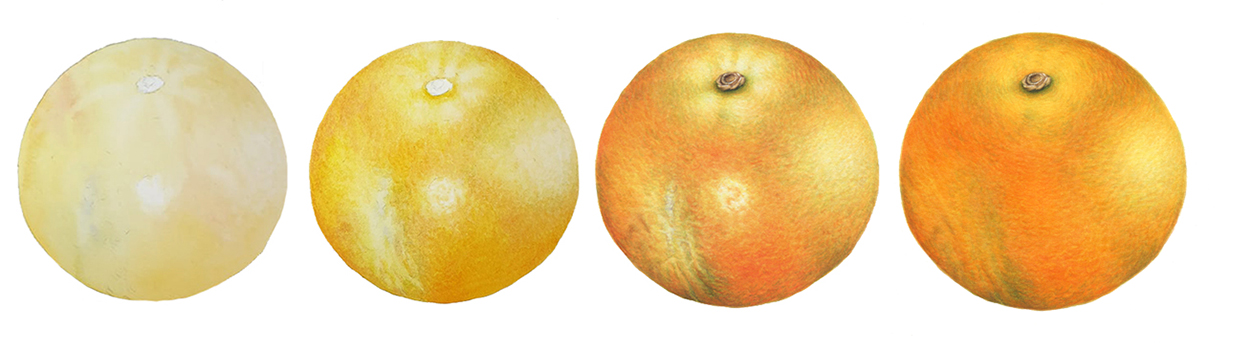
The first of the orange illustrations is complete. Here you can see the process as I develop the orange illustration to our end point. Importantly, Ive approached the piece in a way that gives both the client as much room to move and refine the design and all the considerations that come up as the project evolves, and me as many options to change directions to meet those need where necessary. The final adjustments were made in the last image, altering the balances to suit all our specific design requirements, sacrificing highlights, evening out the tone for a more consistent aesthetic, and making the orange more vibrant in colour overall to achieve the final result. With the first aligned with our vision I am able to move into the next with far more clarity and easy.
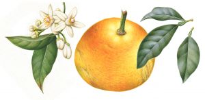
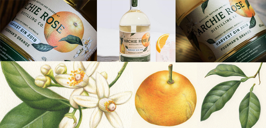
In this case Ive illustrated each design element separately to give ourselves as much diversity of the imagery as possible, so I begun working on the orange leaf illustrations next, follower by the stems and the cluster of orange blossom flowers. The rich green leaf elements amongst these elements will be incorporated into the design, crossing the colour palette over from artwork to the corporate logo to tie everything in together nicely. Working with separate illustrations like this keeps the greatest application diversity in the graphic design process for the finished label with many variations possible, so we now have plenty to work with throughout the design process beyond my hands.
Handing the images over to the next team of creatives, they continue to develop the illustrations into a bigger picture that meets the client and product needs, functionality, visual appeal, consistency with the clients brand… Finally we have the finished product, another beautiful result for a truly impressive client. You can see more on the poormans orange illustrations coming to life in this short clip
******************************************
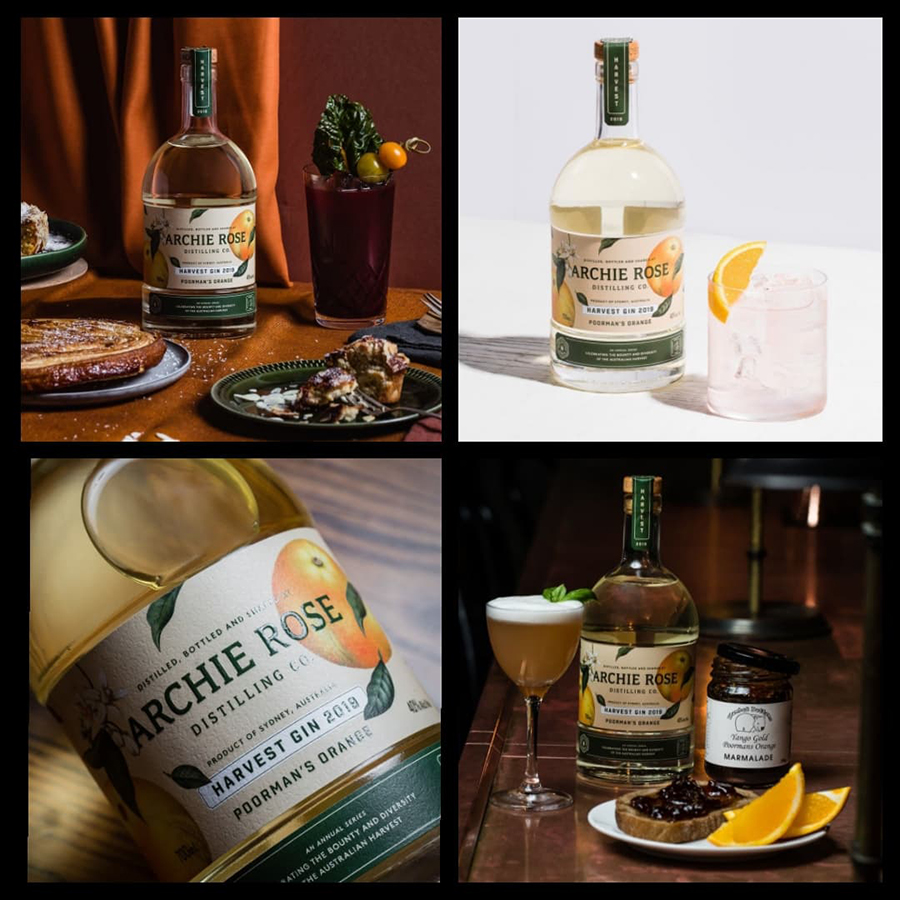
A little update on the Archie Rose Poorman’s Orange Gin project as it unfolds in time. These more recent images are thanks to AR, but doesnt it look wonderful! Yes, I am very pleased to be a part of this vision and to see it continuing to tell its story.