Le Petit Rosé Wine Label Illustration – Jacobs Creek Special Edition Rosé Commission
I love working on these projects… On my studio table this month is a fabulous new commission working with another wonderful client we all know and love, Jacob’s Creek, and I am thrilled to be working with another high profile client who is as dedicated to their craft as I am. I feel its such a testament to my work and efforts, an honour to help another wonderful project find its wings and Im looking forward to working with this team in the coming weeks.
Images taken from the Jacob’s Creek website. What a stunning place the Barossa Valley is.
Though Ive had to keep the project totally under wraps for a while now, the brief is to complete a celebratory, botanical based wine label illustration for a special edition bottle of Rosé set to hit the shelves for two of our favourite events on the calendar, Valentine’s Day and Mothers Day. So after all this time working behind the scenes and waiting as the project unfolded, its great that I can finally share the background of this work with you here at last. Its all about bubbles, butterflies, roses and celebrations… It really cant be bad can it!
With romance and mums at heart, Ill be working with delicate pink and peach roses with fabulously contrasting rich blue foliage features with beautiful rose petal confetti sprinkles over the design. Piece of cake right?! Sure it is, but it really is a fun and beautiful concept and I am pumped to get into it! The best thing is, even if youre not in love or arent a mum, you are still allowed to enjoy it too. I know really want to have some… But first, work calls as usual! Thats how my life goes though, I work so I can drink, then I drink because I work, then sometimes I work so everyone else can drink, and everyone is happy.
But first, a little about the Jacob’s Creek company – Located along the banks of Jacob’s Creek in the heart of the gorgeous Barossa Valley, their vineyards stretch from the Barossa to Adelaide Hills to the Coonawarra, the Jacob’s Creek Vineyards has been in operation since 1847, which really is an amazing history. Over the years they have built their reputation and brand to become a household name and continue to flourish to this day. Their production and distribution are tremendous, which I am saying without any research at all, I just know that anywhere you go far or wide, it really is a brand youll see no matter the location or event and thats quite a remarkable feat to achieve for any brand.
So getting started on the project was met with the usual placement of the magicians hat upon my head in preparation for the gruelling deadlines of commercial illustration, and I knuckled down to yet another long weekend working in my studio. Its standard and I knew well what was ahead of course so kettle on, I started to really get my teeth into the brief, soaking in all the detailing and information to enter the creative space of the team that came before me. I am always a late comer to these stories so there is always a little time in finding that alignment with the team, but soon enough I was up to speed and began working through the design process with the familiarity i needed.
Familiarity evolves to an intimate relationship in this stage. Layouts, design, drawing, taking into consideration every application need and challenge, the styling a client needs or wants, understanding the print process around each illustration along the way, refining the elements, colour, placement, aligning it to the brief one last time as you go until the concept drawing is ready for the first set of changes and approvals. The main challenge at this stage, apart from… everything… is the design in this case is clear, and 3 dimensional so the layout is only ever partially visible, however the transparency means there are endless interplays to consider as the bottle is rotated. Its tricky but really cool to get your head into.
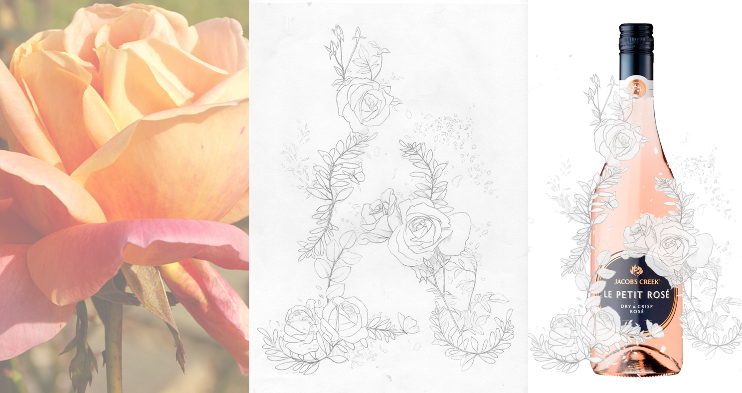
First roughs and the product placement for the wine label illustration is battled out, refined and approved ready for rendering.
With the layout thoroughly considered, every detail tweaked and finally approved the next challenge is determining the colours. Unlike my usual painting or illustration, the colours are very much in my hands to decide on however in the instance of many commercial brief youre actually working to someone else’s vision and needs with registered brand colours and specific selections of Pantone colours that must be adhered to, as it the case with this project. With this comes another mental and creative shift from my perspective in order to translate what was into what must be. Fortunately I am good at this and managed to match every colour in the Pantone palette very close to my own in one shot. I guess practice makes that easier!
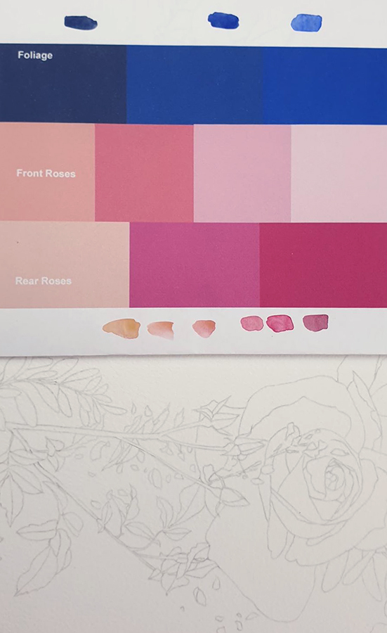
Working with the colour process now, Im matching the artwork and Pantone swatches to my own palette to begin painting
Now that I have my colour recipe locked into my head, its time to wet the brushes up and start bringing this painting to life before that deadline creeps any closer! Pinks, peaches, blues, lets get into it. What was a relationship now turns to a love affair… roses, pinks, so beautiful.
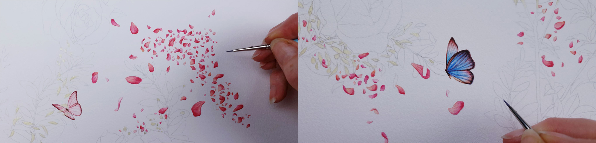
The scattering of confetti takes time to create because every petal and part needs its own uniqueness and handling to avoid anything looking generic or impulsive. Variations in colour, form, size and placement are critical to the visual results, but also to creating a sense of flow to the layout, and eventually the bottle.
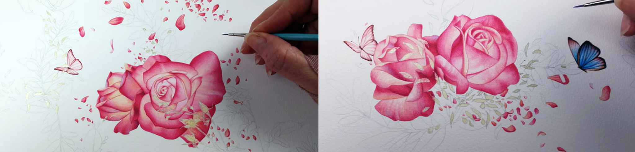
The roses begin. There are 5 roses in all that adorn the front of the bottle from top to bottom, and also stretch beautifully around the sides as well. They are feminine and pretty, nestled in amongst the foliage, butterflies and rose petal confetti details. Slowly it comes together!
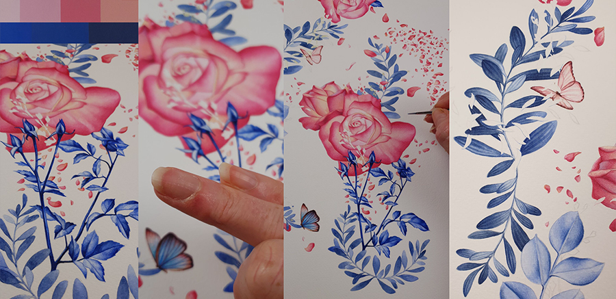 Another weekend working and the telltale sore fingers tell me the end of this project is getting close. Detailing the tonal foliage in blue has been fussy but fun work, the challenge being to maintain variation and interest using a very limited and specific range of blues in my palette. Subtle variations to my mixes and balances achieve this and as this element to the design is completed I am left with the gold flecks of confetti sprinkling through the artwork to complete this painting.
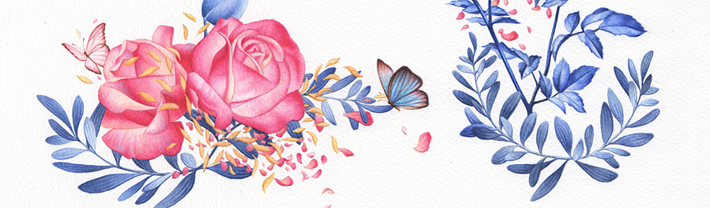
The bottom edge of the wine label illustration
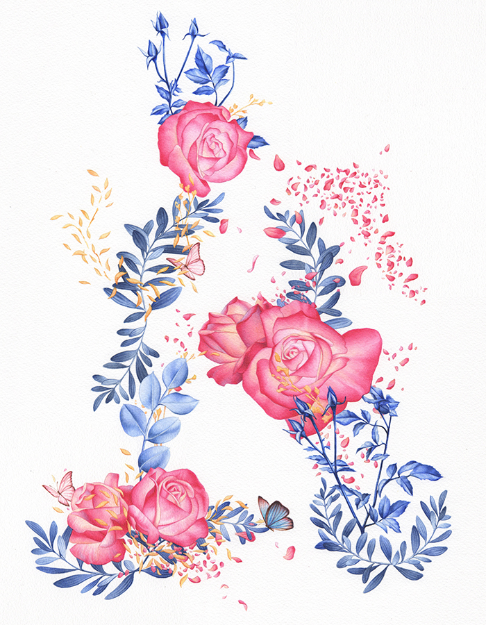
The completed artwork for the clear wrap around wine label bottle, a beautiful arrangement of pinks and blues, butterflies, bubbles, roses and scrolls of foliage completing the picture
*************************************
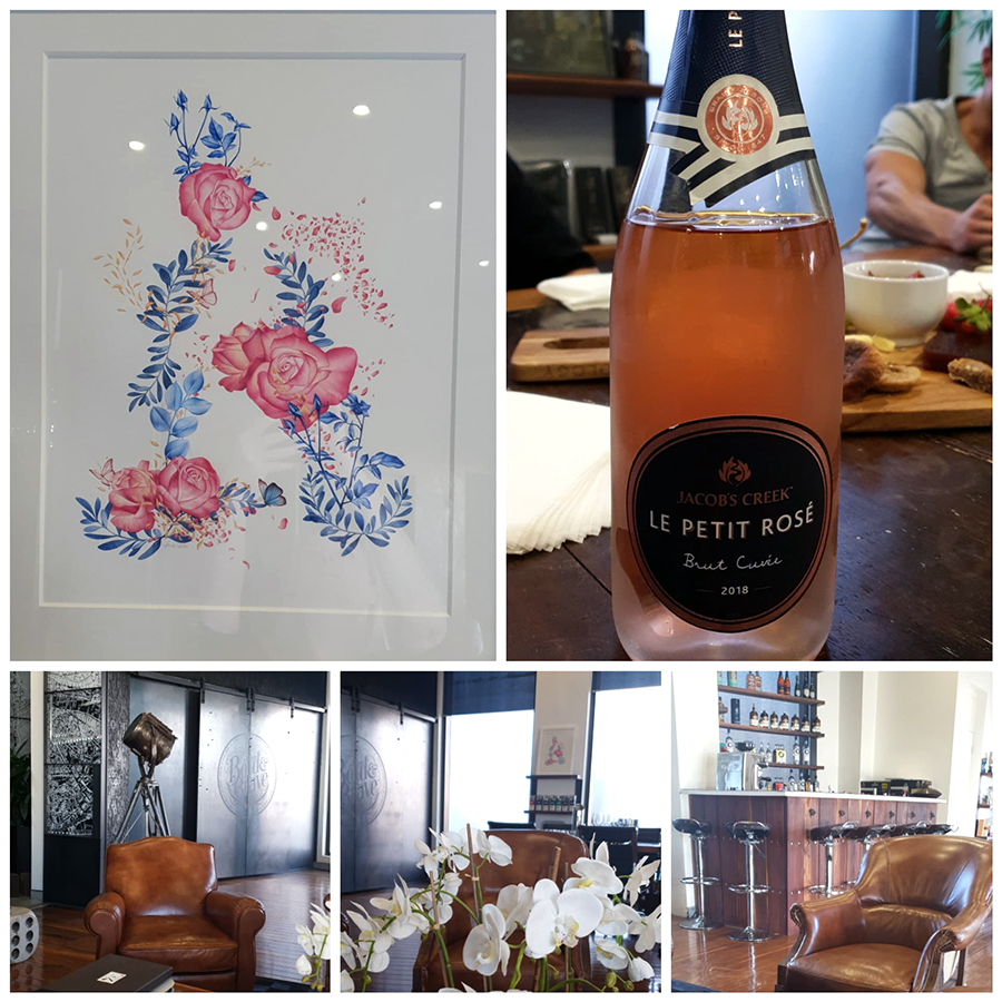
July update – It has certainly been a wonderful afternoon for me! I was so honoured to be invited to meet and greet the amazing creative teams working on all sides of this project today. In this remarkable studio space we came together to celebrate the end of the illustration stage of this project over gorgeous cheese platters and a drop of the beautiful Jacob’s Creek Rosé weve been working on as well. Whilst the bottle looked decidedly bare without its wrap around of roses, those days are now very numbered as we look forward to seeing the end product very soon, and to the launch of this beautiful celebratory rosé early in the new year too. It will be very widely available by all accounts!
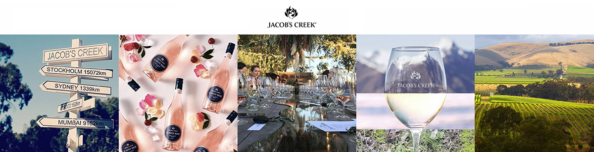
January update – And so the new Jacobs Creek Rosé is on the shelves, breaking the new year in in readiness for Valentines Day and Mothers Day celebrations. A beautiful, feminine bottle looks and feels the part and I am feeling pretty proud to see the final results of another wonderful project come to fruition so beautifully. I am finally able to share the end results with you and look forward to enjoying a glass of this wine from my own bottle as soon as I have time to leave my studio to find some! I hear from good sources, its everywhere. My eyes on the world know wine well hahaa, but in fact i believe this new Jacobs Creek Le Petit Rosé is available worldwide so keep an eye out and cheers to you all!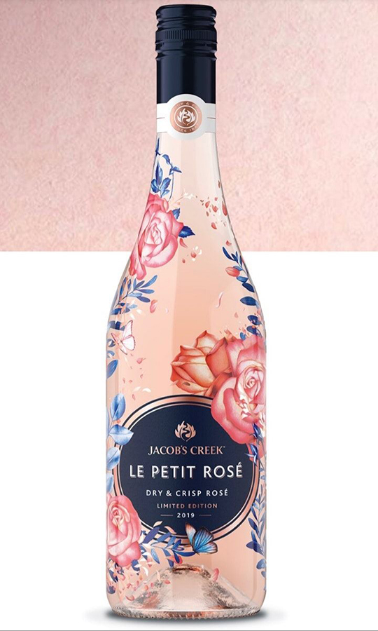
Jacobs Creek Rosé with my rose, butterfly and foliage wine label illustration adorning the Jacobs Creek Le Petit Rosé bottle. I think it looks just great mate… Cheers!
*****************************
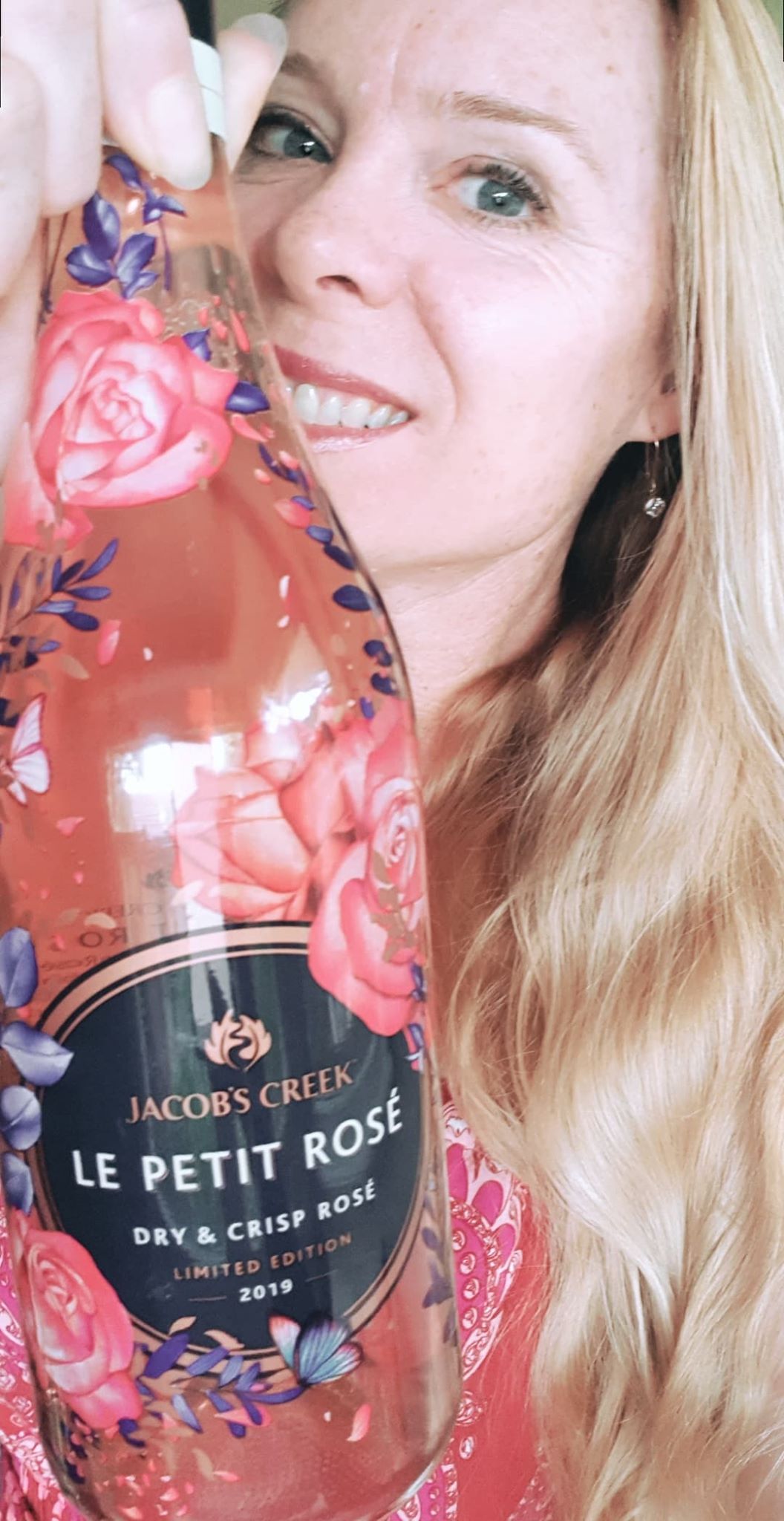
What better way to start my day with a gift and a smile at my front door. Blessed… I told you I love these projects!