Banrock Station Wine Label Designs
With the news arriving that Banrock Station have released their spectacular range of wine label designs featuring my work, I am finally able to share the end results of our efforts with you. With 6 designs in all, this is a perfectly aligned body of commercial work that that could not have been more ideal for me as an artist. Taking advantage of my graphic design background, and my experience in natural history and botanical illustration, it was a venture that could have only one result… success! I thoroughly enjoyed working with the good people at Banrock Station to create this beautiful range of wine label designs. I am certainly feeling very proud of this work and it brings me great pleasure to share these much anticipated results with you today!
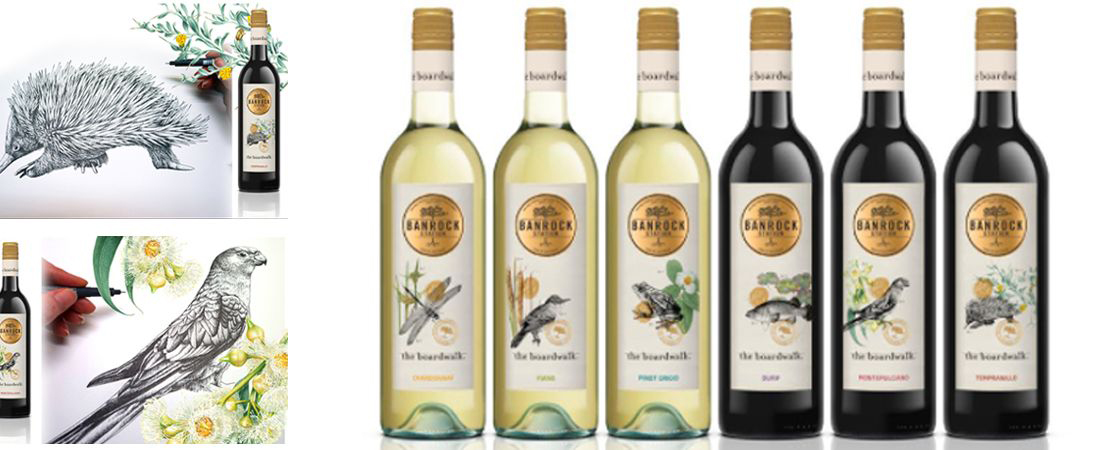
Banrock Station lies in the Riverland region of south-eastern South Australia by the Murray River, and has been recognised as being of international importance by designation under the Ramsar Convention. The Wetland is subject to an ongoing environmental restoration program which manages the wetlands and promotes ecologically sustainable land use practices. It supports several threatened animals, providing habitat and breeding grounds for wildlife for whey have received Wetland Conservation Awards in recognition of its conservation efforts in the past. I not only loved that this brief took inspiration from our beautiful natural world, but that eco aware Banrock Station’s concept was to focus closely and quite fittingly on their own local environment for this exclusive range of 6 cellar door wine and their labels. The wines are designed to encapsulate the uniqueness and beauty of the boardwalk site, with this range of labels suitably representing its animal inhabitants and plant life of the area. Subjects represented in this series include thesouthern bell frog, short-beaked echidna, regent parrot, reed warbler, murray cod, dragonfly, spiny-flat sedge, bullrush, the common nardoo, river red gum, spiny daisy and the gorgeous swamp lily.
Graphic design and commercial work always brings us new challenge, perhaps especially to those who have enjoyed the luxuries of working on our own terms and inspirations in fine art… At least this is my own experience. It pushes you out of comfort zones and into interesting new territories on many levels. Breaking out of our usual groove can be a revitalising opportunity to expand our skills, experience, perspective and horizons. It operates on tight deadlines and requires you to produce work with far broader design considerations and application requirements than we are accustomed to in the fine arts. It is rarely about working on our own personal terms, so it is an interesting mental and emotional shift we make. In fine arts we work with our own creative visions but in graphic design, we are a vessel by which someone else’s vision is materialised for a specific purpose. It is far more dimensional and demanding in that sense. It is a different head space, and i absolutely love it.
The BEST thing about my wine labels, is they also come with wine! I know right…? Can life even get any better than that? I really doubt it! So if you are in the area, perhaps you could stop by this wonderful vineyard for a lovely bottle… or 6, and send me YOUR pics enjoying the fruits of our labours with us. Its so many kinds of celebration ~ ENJOY