Sacred Kingfisher Illustration – Council River Protection Agency Commission – Watercolour and Ink – A4
Amongst the new projects freshly landed on my studio drawing board at the minute is a beautiful little project to create a Sacred Kingfisher Illustration for the Birrarung Council. The Birrarung Council was established about a year ago under the Yarra River Protection (Wilip-gin Birrarung murron) Act 2017 to be the independent voice of the Yarra River as a single living entity, to advocate for the protection and preservation of the Yarra River. As such, they have approached me to create this Sacred Kingfisher illustration for their logo. A realistic bird painting…? it is of course right up my alley!
The Sacred Kingfisher was chosen to be featured in the logo as it represents the ‘overseeing and protecting’ aspect of the organisation. A local native, the Sacred Kingfisher is a strikingly beautiful bird which lives by the Yarra River, making their nests in the banks they call home. The relevance, elegance and strength of these remarkable birds making it a suitable representative on all fronts.
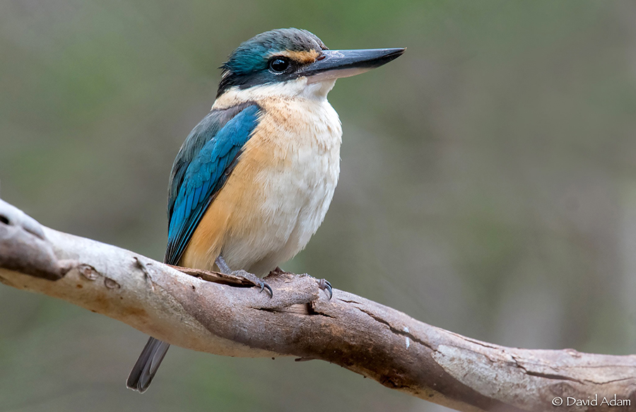
This image of the Sacred Kingfisher was taken by my friend David Adam. Its such a gorgeous image I wanted to share it with you… beautiful work as always
In this case, the illustration will be used across several applications and with that comes several design considerations to ensure the balance and design works well however it is used. This time I will also be designing the artwork in two styles, a black and white version rendered in ink as well as a full colour illustration in watercolour to bring additional diversity to the image and its use. The artwork must be realistic with a graphic element to it, work in small sizes, be dynamic and eye catching whilst being easily identifiable as the Sacred Kingfisher.
And so I set to work, researching the subject, trawling through my vast reference files, giving my thought to all aspects of my clients needs for this beautiful study, ensuring that it ticks all of our collective boxes. Actually its not an easy process, clarifying a clients abstract visual concept to a physical form thats just right for a functional purpose. You need to be able to get on the same page as a client to understand their needs and vision intimately, then apply your own expertise to the mix to make it work. As artists we are skilled at clarifying our own vision to our creations. Doing this for another is just another extension on that skill. For me its one I love, value and learn so much from. It is a delicate art, a proficient balance of honouring another’s vision through your own. Being a part of bigger visions is something I truly enjoy.
Time passes fast in the studio, way too fast, but finally I have constructed, refined and created a drawing I am pleased with for the layout. Its a dynamic pose with a forward sweeping wing that brings movement and impact to the image. It interacts with the council logo wording well, the Sacred Kingfisher just sweeping to a graceful halt on the capital ‘B’ of its name. The turquoise and blue of the bird, a wonderful splash of vibrant colour added to the mix.
A simple conversion to rudimentary black line work starts to give me an idea of how the illustration works in ink. Much refining is needed for the finished ink rendering, but for now I am pleased with both versions and its time to return the concept to the client. ‘Looking good!’ shortly after is an assuring reply, and we continue on our way, rendering the final artwork of the kingfisher in watercolour and ink.
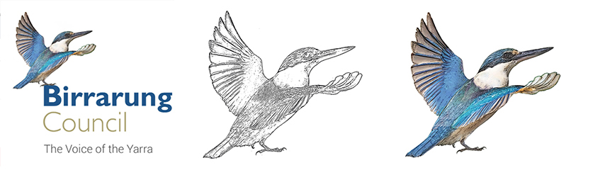
Sacred Kingfisher illustration mock ups, in the logo situ, a black and white rendering and a full colour version of the same study, now ready for the approvals process
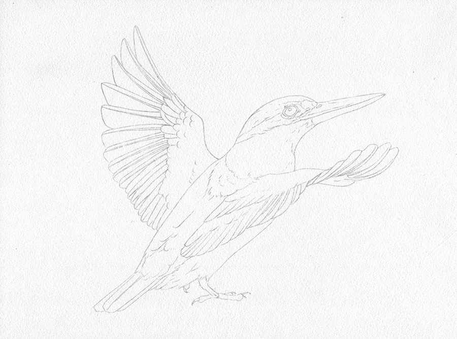
The first step is to create the refined graphite drawing, a clear plan forwards towards the ink rendering
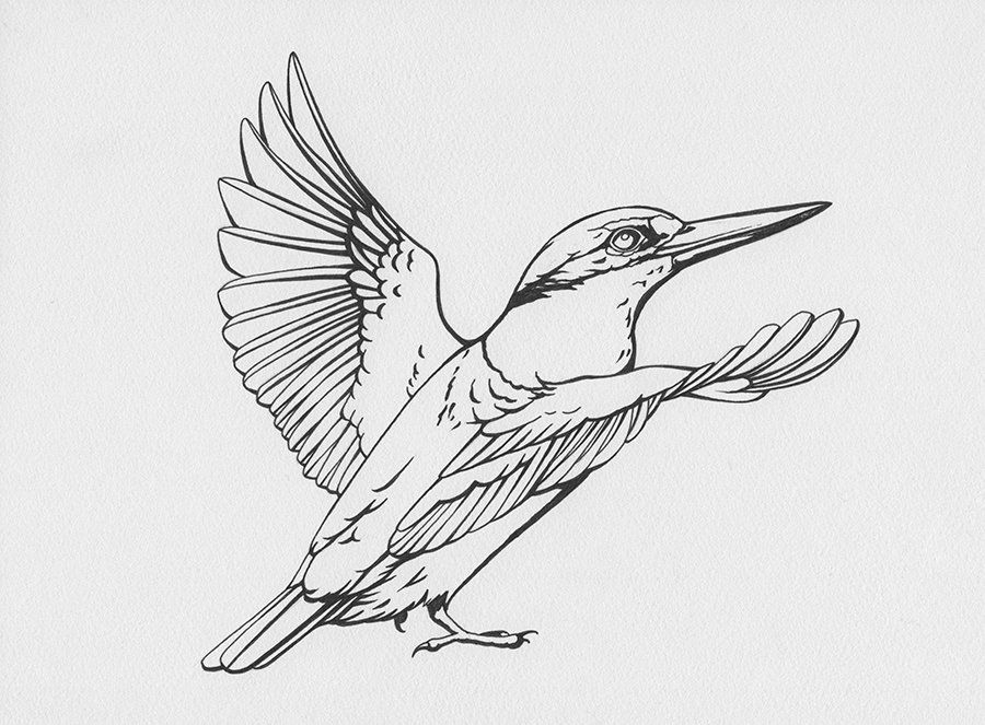
The ink outline is rendered using waterproof ink to ensure its compatibility with the wash application in the next step
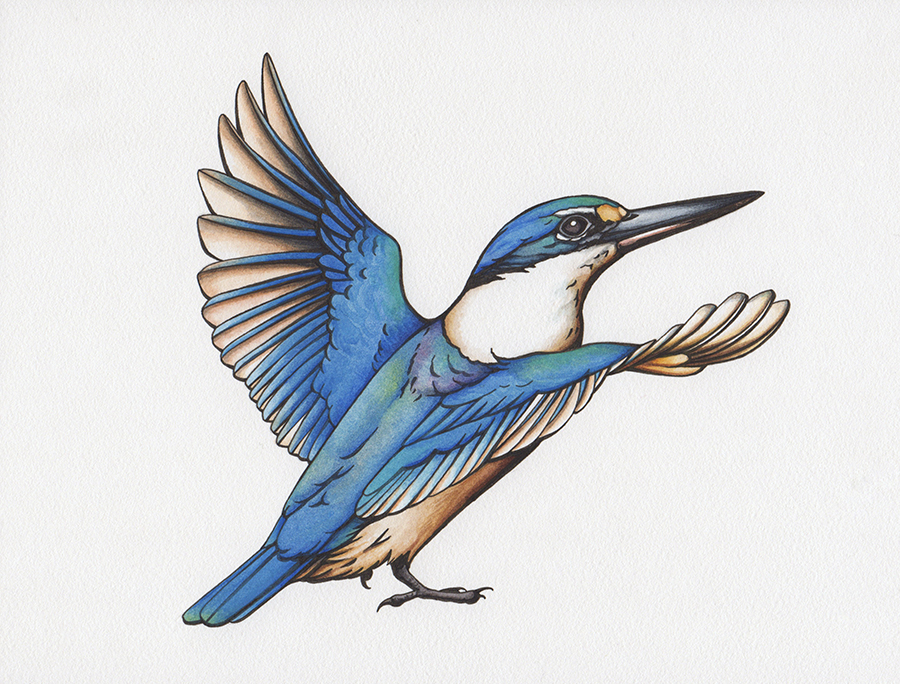
Now we complete the kingfisher illustration with simple watercolour washes and rich colour, tightly defined by the ink outlines
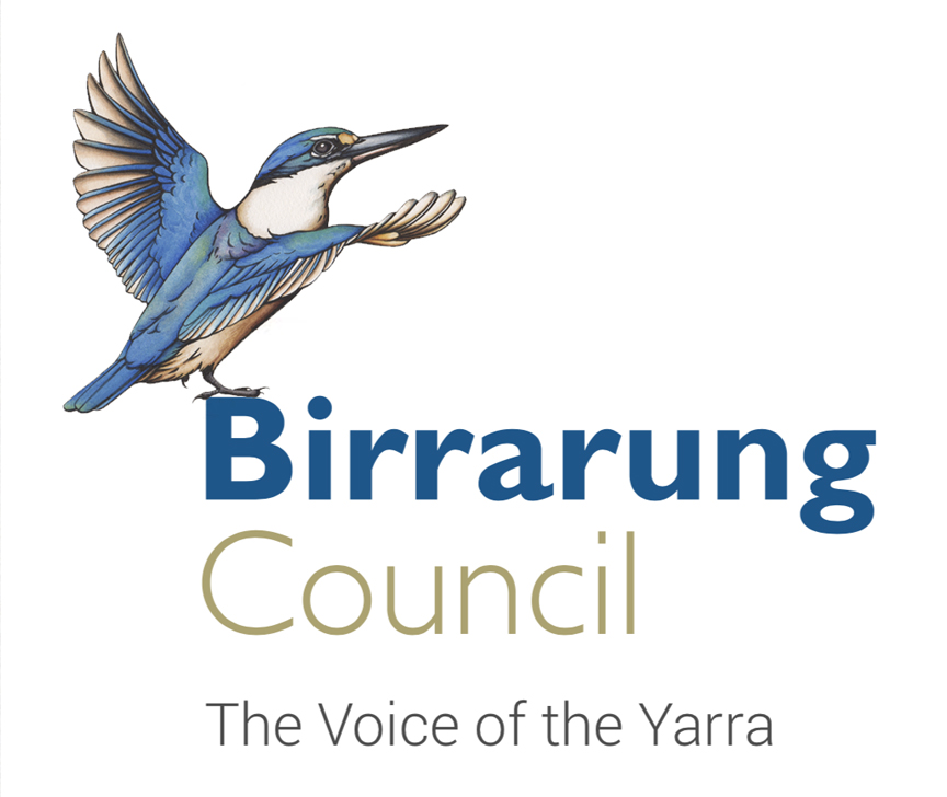
The final outcome, the kingfisher illustration in place with the logo