Hemp + Fruit Ink Illustration – botanical package design
On my table currently is a wonderful new project that is not only an exciting opportunity for me to enjoy a change of medium for a moment, but to be a part of my clients exciting new project. I absolutely love collaborations like these, and helping my clients bring their visions to life brings me so much growth and very real satisfaction.
The business and the brief revolves around hemp at the heart of our focus for this illustration accordingly. This black and white illustration will be used for the companies product packaging and beyond, and it will be embellished by a gorgeous, eye catching metallic lettering feature to counter the simplicity of this illustrations styling perfectly. For the illustration itself, Ive designed it in a way that gives my client the broadest versatility and options for its use as possible, large, small, multi directional, or as a repeating pattern… Its going to be suburb, a brilliant combination of exquisite detailing and timeless simplicity.
With me, my commercial clients know in my hands they will have peace of mind, expertise, reliability and the highest quality illustrations from me every time, and thats truly hard to find these days! Speaking to my client, our alignment seemed so immediately clear, our direction was clarified, and we got started on the project very soon after.
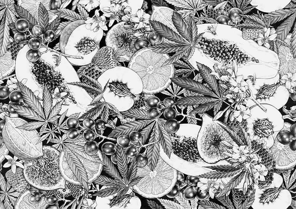
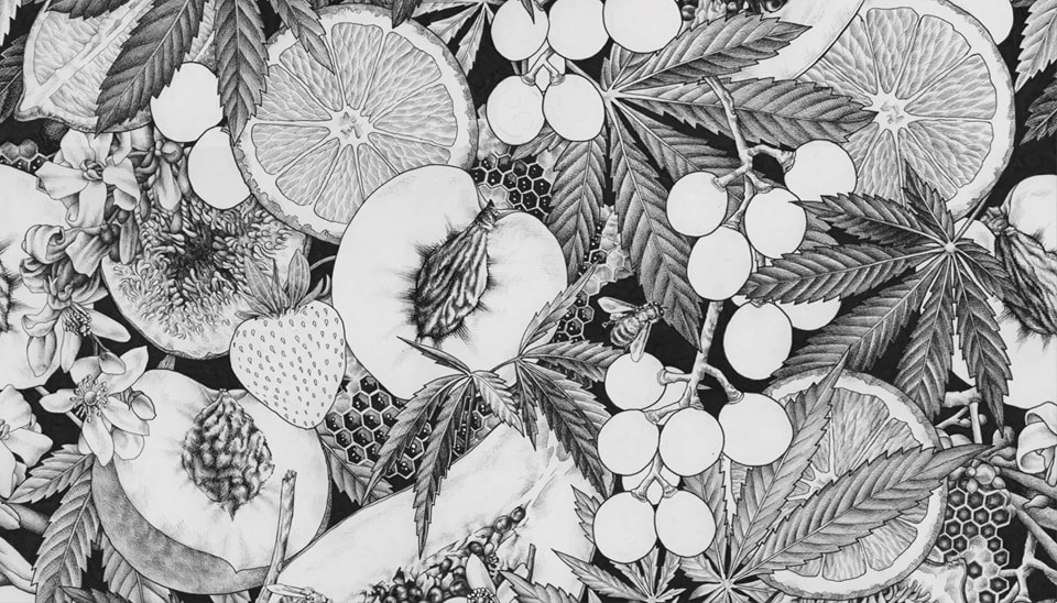
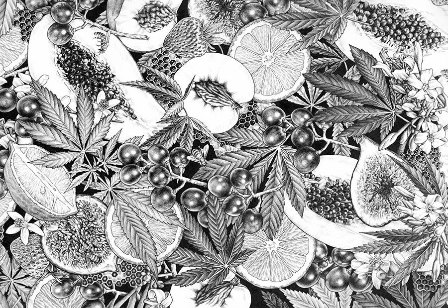
Whilst this 35x50cm artwork is to be rendered in black ink for a change, of course the botanical subjects included in this piece are in very familiar territory for me. ‘I want the cut through background to be black with lots of depth and layers of botanicals, with a ‘the more you look the more you see’ kind of feeling. Intricacy, detail… bees, honeycomb… papaya, citrus, grapes, hemp leaves, peaches and strawberries’. Of course, he won me at ‘intricacy’ and I was in my own little world by the time bees were mentioned! The rest is history.
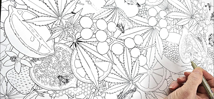
With the rough idea mapped out, I began the process of subject selection and creating the composition. Balance, flow, tone, depth, textures, its a slow and thoughtful process to create a concept from nothing, especially when it must align with anothers imagination rather than your own, as well as all the commercial applications and considerations the artwork requires…but i love it.
With the structure in place I began to embellish the layout, giving deeper thought and consideration now to the finer aspects of this story. Adding papaya and citrus blossom brought the additional intricacy and luxuriousness I wanted to the balance, and the addition of the figs, though a wildly challenging and ridiculously time consuming element to render for me, seemed such a perfect and textural conclusion to the mix. Fortunately the client agreed and so I made the last of the refinements before starting the first stage of the drawing… hello again, my blistered hands!
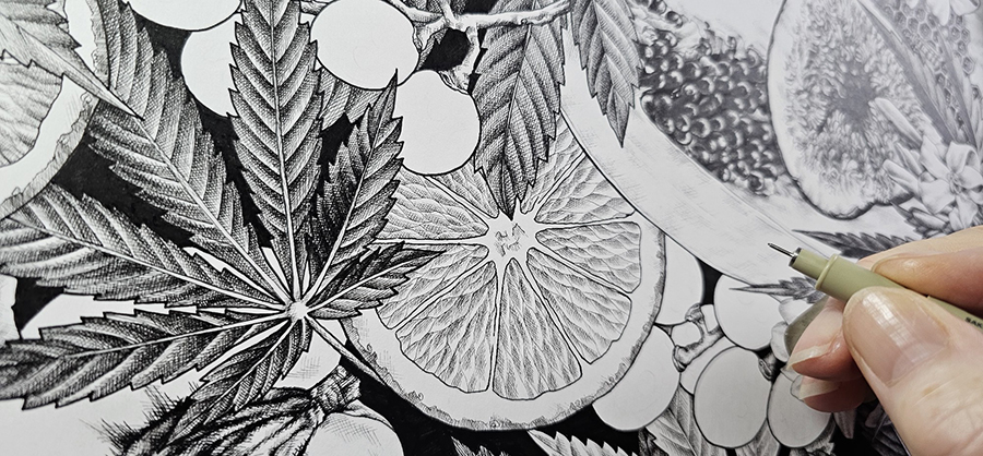
With the drawing complete, it was time to start the very long process of converting the graphite to ink, capturing the design with confident, accurate strokes, bolder in the depths, finer in areas of subtly. Again, the process takes a lot of time, but one stroke at a time, i had created my foundation and structure, giving me a very clear plan ahead. Its precision work with no room for error… in fact its as black and white as the drawing itself. Now its time to get truly lost in this illustration, splitting the hair more and more as I go, to create the refinement and intricacy I seek in this drawing.
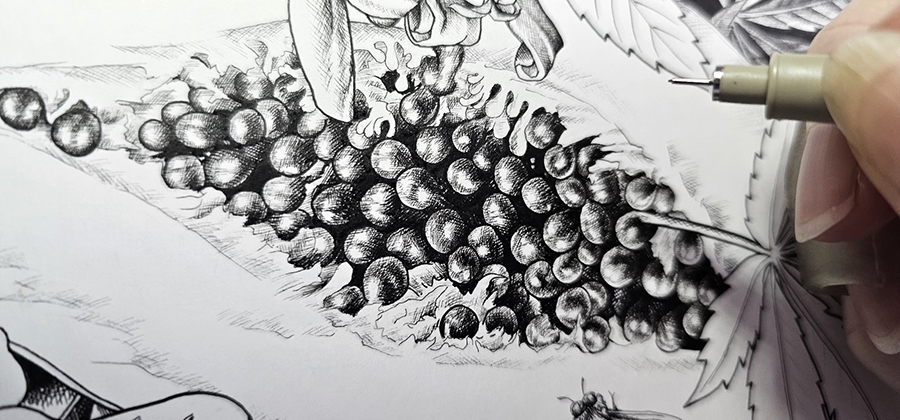
Refinement begins, creating texture and tone one solid black line at a time. Layers develop the tone, from the delicate white of the papaya and citrus flowers to the jet black of the cut throughs. The papaya seeds create a perfect transition of this richness, along with the amazing texture these features bring. A nightmare to render, i remain captivated by the emergence of every stroke and seed. The romance of the figs was as beautiful as I hoped in the composition, your thoughts slipping away into its whimsical depths. The honeycomb drifting throughout this illustration creates such uniqueness despite the challenge of its structure in rendering. Clusters of rich grapes punctuating the scene with their pop of light and dark, bringing a ribboning flow to the balance with it, and the citrus once again, bringing such wonderful structure and new texture to the table too. Finally we have the hemp leaves, weaving through the elements from the foreground to the back in lovely, varying tones and wonderful textures.
One step at a time, one element at a time, this beautiful illustration comes to its inevitable close, my client noting ‘Its honestly looking stunning. I love it. I appreciate your dedication… and this has exceeded my expectations’ feeling like a beautiful acknowledgement and wrap to this project. Now its time to hand the illustration over to the design team for its next wonderful lease on life and chapter, and I have every confidence in its success. Thank you everyone for following along with me on this fun sidestep into all the things I love in this perfect collaboration. Ill share the updates of the next stage as they come to light.
Ive just uploaded a little video of this work in progress to my YouTube Channel too, so check that out if youd like to see more!
Of course, if you have any commercial illustration needs, please let me know. Im always here to help bring your ideas to life 🙏🏻

