Wine Label Illustration – Banrock Station
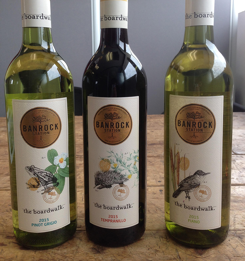
Wonderful people, a wonderful concept and a wonderful brief… what better way to work is there than this? Crazy exciting deadlines included, this was a commercial illustration brief made in heaven for me. Producing 6 wine label concepts and a total of 12 intricate illustrations (including 6 intricate botanical illustrations and 6 detailed ink rendered wildlife drawings) in record time, we wrapped this exciting project up bang on the deadline with beautiful results, and with one of my favourite things of all… very happy clients!
Banrock Station lies in the Riverland region of south-eastern South Australia by the Murray River, and has been recognised as being of international importance by designation under the Ramsar Convention. The Wetland is subject to an ongoing environmental restoration program which manages the wetlands and promotes ecologically sustainable land use practices. It supports several threatened animals, providing habitat and breeding grounds for wildlife for whey have received Wetland Conservation Awards in recognition of its conservation efforts in the past. I not only loved that this brief took inspiration from our beautiful natural world, but that eco aware Banrock Station’s concept was to focus closely and quite fittingly on their own local environment for this exclusive range of 6 cellar door wine and their labels. The wines are designed to encapsulate the uniqueness and beauty of the boardwalk site, with this range of labels suitably representing its animal inhabitants and plant life of the area. Subjects represented in this series include the southern bell frog, short-beaked echidna, regent parrot, reed warbler, murray cod, dragonfly, spiny-flat sedge, bullrush, the common nardoo, river red gum, spiny daisy and the gorgeous swamp lily.
Graphic design and commercial work always brings us new challenge, perhaps especially to those who have enjoyed the luxuries of working on our own terms and inspirations in fine art… At least this is my own experience. It pushes you out of comfort zones and into interesting new territories on many levels. Breaking out of our usual groove can be a revitalising opportunity to expand our skills, experience, perspective and horizons. It operates on tight deadlines and requires you to produce work with far broader design considerations and application requirements than we are accustomed to in the fine arts. It is rarely about working on our own personal terms, so it is an interesting mental and emotional shift we make. In fine arts we work with our own creative visions but in graphic design, we are a vessel by which someone else’s vision is materialised for a specific purpose. It is far more dimensional and demanding in that sense. It is a different head space, and i absolutely love it.
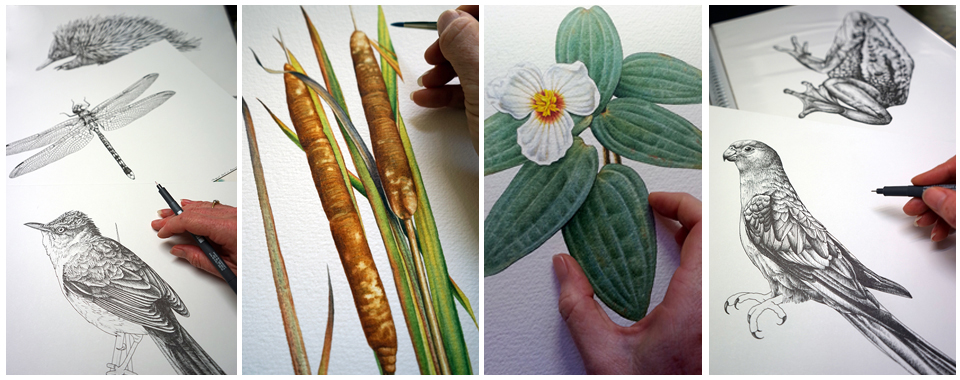
The upside of having a proven, established, professional reputation with a specific area of expertise is that more and more, the briefs that come to you tend to be more and more relevant to your skill and specialty, as was the case in this instance. The Banrock Station brief couldn’t be more suited to the work that I do and it was an absolute pleasure to take it on and to create something beautiful for them. There were some shifts in medium and design requirements to consider with half the illustrations rendered in stylised ink, but they were so much fun to work with and I had every confidence. I loved the process and we are very pleased with the results. This range is just being released now, and whilst I am not able to share the end products with you just yet, I have been given the ok to share the studio shots with you today. I hope that you’ll enjoy this sneak peek and a glimpse into this fantastic brief in process… and stay tuned for posts of the final results!
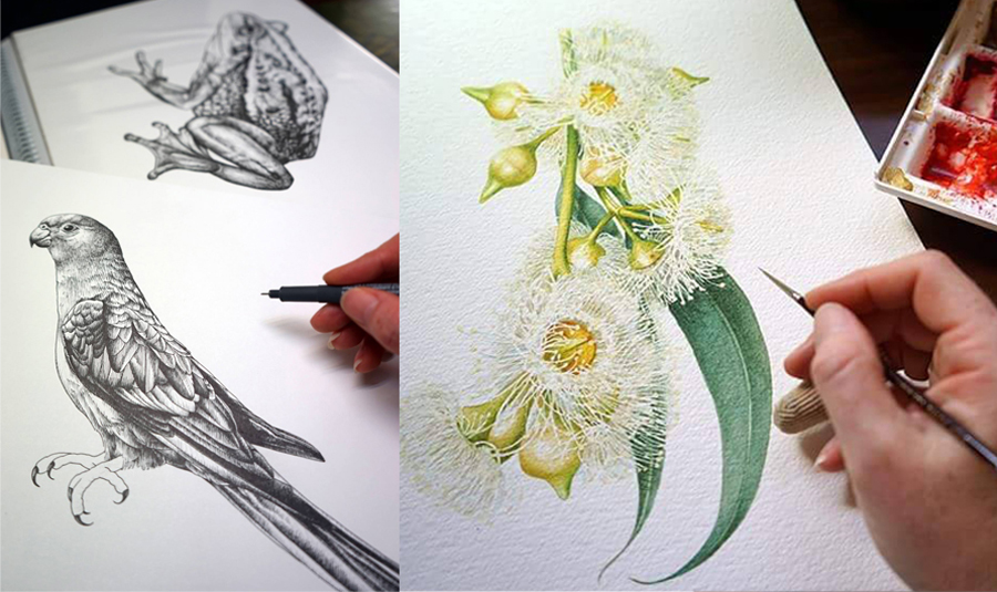
Here we can see the first of the new Banrock Station wine label illustration pairing featuring a local Regent Parrot and Eucalyptus, a really beautiful coupling for the first design. Each marriage in this series features a wildlife illustration rendered in ink and an accompanying watercolour botanical illustration of subjects found at Banrock Station itself… sharing a handful of studio images on the hop as i work through this project.
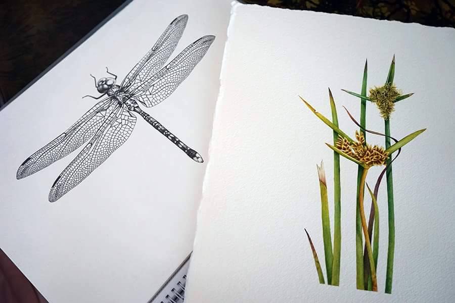
The next is a dragonfly illustration in ink and a cluster of gorgeous earthy coloured reeds rendered in watercolour… an elegant match!
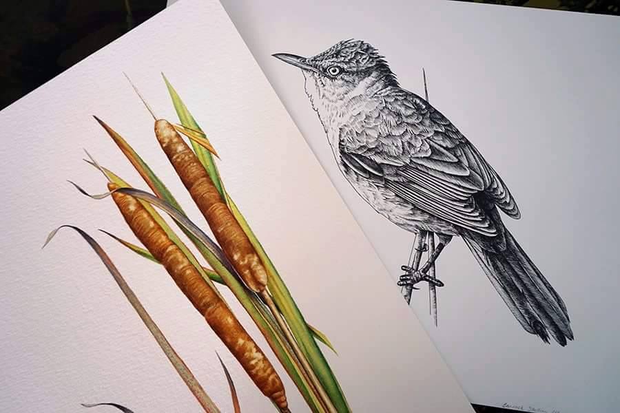
I love this combination, a Reed Warbler amongst the Bullrushes, two more wonderful illustrations to feature on the Banrock Station wine label designs
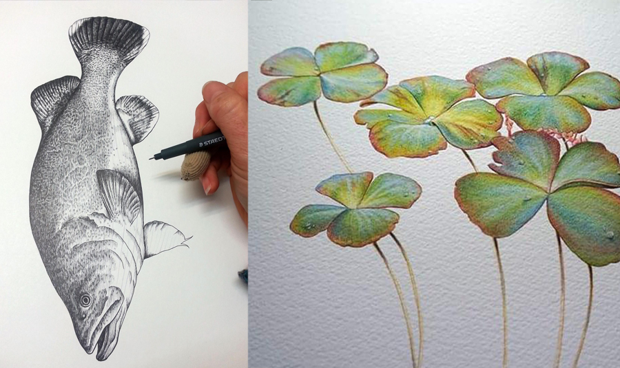
Water themed, a wonderful fish illustration of a Murray Cod, coupled with these magical Nardoo waterplants for the next beautiful wine label design
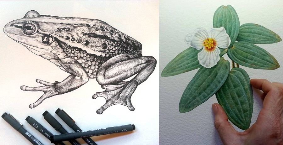
A clear favourite, a Southern Bell Frog illustration set amongst another wetland plant, the swamp lily
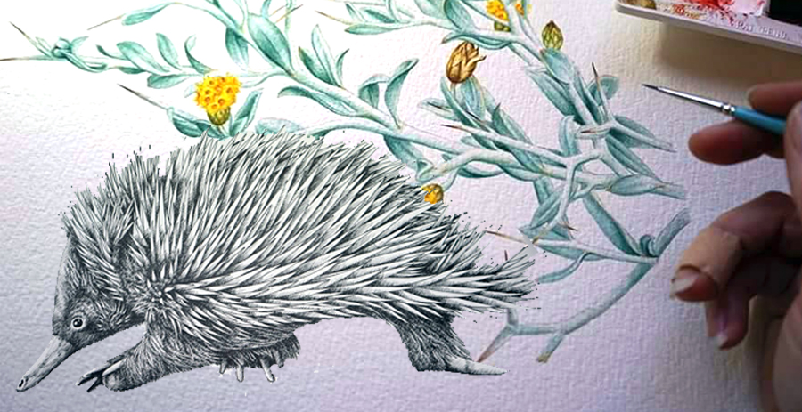
And lastly, a sweet little echidna illustration amongst the Spiny Daisy to complete the series
******************************


