Wine Bottle Botanical Illustration Commission
Ill start by saying, I love this project… I know I know… Ask me again at the end hey? Well lets start by saying there is nothing better than a brief landing in your hands that is made for you. I am so fortunate that way, with so many wonderful projects coming across my studio table that I feel this way over. This time was no different, feeling an instant alignment and confidence in. You know right from the start when a job is a perfect fit, and this one certainly feels that way which is a great start. Its an honour, a thrill, I am just so pleased to be a part of the my clients vision in this way.
Now its in my hands, thrill turns to responsibility! Thats actually a huge thing. Being swept away by pretty images, fabulous ideas and the creative visions of a client are one thing, but to actually bring this creative vision and dreaming to life, to a physical form, is quite another! Oh i haaaate responsibility, but here, I have nothing but every confidence of making exactly that happen and every enthusiasm to get started.
Every commercial job starts out with these exact words… ‘the client is on a very tight deadline’ and this is of course, the same… and its true. Commercial projects work at a fast pace and you have to be able to manage the tight timelines whilst not compromising your work or ethics. Hopping right to it, I started compiling my swag of reference gathered over a lifetime of working in this craft… I have a lot!
This commission consists of 6 illustrations, rendered in watercolour with a little stylising to the collection. The illustration will ultimately appear on the bottle cap and sleeve so it is tiny in its final application and here, a little softening in the detail is to our advantage. Still, the studies themselves are quite complex.
The original concept was presented to me in a mix of proteas and non Australian subjects. Now I must capture this same look, feel and very specific positioning of the new elements, converting the selection to a mix of Australian plants. This can be very tricky indeed. Changing any element changes the balance of all. The colour, story and visual mix and flow changes significantly, so within this, there are many things to consider and solve.
Ultimately I have a waratah in bloom, a waratah in bud, a scarlet banksia, a native orchid, a cluster of eucalyptus leaves and a spoonwing lacewing… my new favourite insect! What a gorgeous collection they make too. Next, I have to create and draw these elements to fit neatly into the template, designing and positioning each one in a way that aligns with the brief as precisely as possible. This is difficult to do again, as the ‘story’ of each subject is now changed with its own characteristics.
Slowly but carefully and surely, all 6 elements come together in a rough drawing form. Each are lightly coloured to assist the client get a read on the all important visual balance which is significant. The values change a lot with colour alone, and this isnt always clear to the untrained eye from a rough pencil drawing. Certainly, it can be tricky when looking at a whole series of graphite drawings placed together in en masse. Reconstructing the original layout with my new drawings is complete and I send them back to the client for approval.
When my phone rings instantly, its a sure sign that they are either super sad – or they are absolutely thrilled. A brief pause had me nervous, as it always does, no matter how many times I go through this process… then the words came in ‘I realise I had picked up the phone and called you before I even finished looking at the work, I AM SO EXCITED! Im ecstatic, really, I am just so thrilled…. its perfect and I cant think of a single change Id make’. Exhale. ‘Good, thats exactly what I like to hear!’ I reply, and onwards we move.
In the end we made one small change, with a simple addition of some lower stamens in one of the waratahas, bringing a little more flow to the balance, discussed red, green, pink and white at length (my favourite kind of discussions) and agreed to move forward without a hitch. With the roughs approved, its time to move on to the rendering stage where we create the finished illustrations for this project. My thoughts shift to refining, colour and styling now, so align the next stage as closely to my clients wishes as possible. Ill be simplifying the complexity of these studies with the application of the pigment, creating beautiful paintings that are simpler in colour use, detail, depth and technique… thats not to say its easier to do! So now Ill step away for a moment to create the refined drawings, taking the project to the next stage.
illustration 1
SPOONWING LACEWING ILLUSTRATION –Starting this series of botanical illustrations and the most divine Spoonwing Lacewing study, I decided to start with insect illustration first. There was no reason at all why, other than I just couldnt wait! I was dying to play with this incredibly beautiful insect painting, with its wings of apricot, pink and mauve, markings of black and those incredibly elegant tails that stream away from its delicate body… so i jumped right in.
The original insect is not these colours of course, but my client has their own colours in mind for this piece, and for the collection as a whole, so I shifted the mix to to create a new, magical and almost fantastical version of this already wonderful insect. Its just so beautiful, and it really sets the tone for the series if you ask me. Indeed, its was a perfect place and painting to start the rendering of the greater project.
illustration 2
EUCALYPTUS LEAVES ILLUSTRATION – With the insect illustrations completed and a better sense of the direction and balance of colour in hand, i start rendering the second painting, the first of the botanical illustrations in this brief… an elegant cluster of wonderfully coloured, sweeping eucalyptus leaves, coming to a delicate connection with its red, orange and pink branch. Its a delicious colour play once more, my palette drifting so seamlessly from blues to greens, mauves and browns to complete this simple but not so simple botanical study. Ive illustrated many eucalyptus leaves in my days, but none are ever the same. Its quite beautiful how unique each painting is. Gum leaves are such a perfect element in a series like this, especially for commercial applications not only because they are totally gorgeous, but because they are so adaptable in colour to any mix and combination. With the gum leaves illustration complete, we move straight into the third painting.
![heidi willis artist illustrator gum leaves_atmata]() illustration 3
illustration 3
WARATAH ILLUSTRATION – This illustration is perhaps the piece that requires the most skill and experience to render as it is greatly adapted to parallel my clients original vision and balance of a concept. What was once a protea, the subject is now switched to an Australian flower of the waratah. Carefully, I designed this new painting subject to align as closely with the original look, feel and plan as possible. With the structure, flow and likeness recreated, my focus shifts to the next challenge of aligning the colour as well as i could. Switching the intense red of the waratah out for far more subtle pinks, yellows and greens, I alter the balance even further in the rendering stage to a completely new, refined story. A now delicately coloured yet striking waratah now takes the stage, completing the third illustration in the series.
![]() illustration 4
illustration 4
ORCHIDS ILLUSTRATION – Now we come to the fourth botanical illustration, and its a little simpler this time, capturing an elegant pair of orchid flowers which rest gently in the background of the design. This element creates subtle fullness and softness to the scene and its a lovely, submissive addition to the mix. Rendering this botanical study, I shifted painting techniques to a wet in wet style which i use very rarely in my own work, wanting to achieve a velvety, understated look to the illustrations, as the brief requested. It worked beautifully of course, its a lovely technique, and the different approach brought an important, subtle point of difference to the mood of this botanical painting too. Delicate mauves and blues into soft pink is always a winner, with touches of earthy yellows to tone it down, and to gently tie it in to the rest of the series.
![]() illustration 5
illustration 5
WARATAH ILLUSTRATION – The second waratah study in this series is a classic, fully open pose of the flower but there are some unique stylising elements to its structure and in its colouring. With a far more orange palette than life, it was actually fabulous exploring such a gorgeous and unique combination of colours in this study. A subject soooo familiar to me felt renewed and alive, and so very beautiful i almost wish we did have orange tinged waratahas! Well, this fantasy, this variation is the luxury of an artist, a story teller, creating a new romance in old territory, and I love it. With number five completed, the end of this project draws near and I feel both keen to bring it to a close and see the series together, and a little sad to see such a beautiful brief leave my studio desk as it must, of course, do.
![]() illustration 6
illustration 6
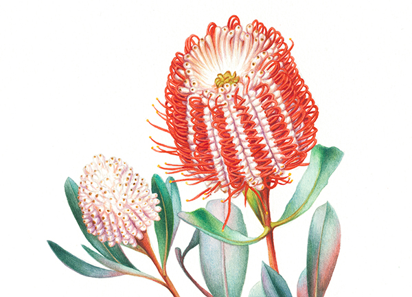
BANKSIA COCCINEA ILLUSTRATION – Coming to our sixth and final illustration, I jump into this remarkable subject with complete enthusiasm! Banksia coccinea has been on my MUST PAINT list for absolutely ever, and somehow this stunning botanical illustration focus has escaped my priorities… until now. Finally, its on the table in front of me with all its challenge, outrageous intricacies and magic. I am so grateful that this project finally brought it to the fore. Of course… of course…. I waaaay overdelivered on this project and every illustration in the series, but i was so in love and well, thats just me hey. We all know I get carried away with the details and wonder of a painting and any natural subject The focus for this study was all about the colour. We needed bright, flame red, and there it was, beautiful and red as ever, my final botanical painting for the set, the Banksia coccinea. Be still my heart…. and now, be still my part of this awesome adventure with it. An honour, a privilege, a total buzz it has been, being such a part of another wonderful project, product and vision for my client. I cant wait to see this one hit the shelves!
And do we have the complete collection of botanical illustrations, ready to hit the shelves in fine form. Thank you for following along 🙏🏻


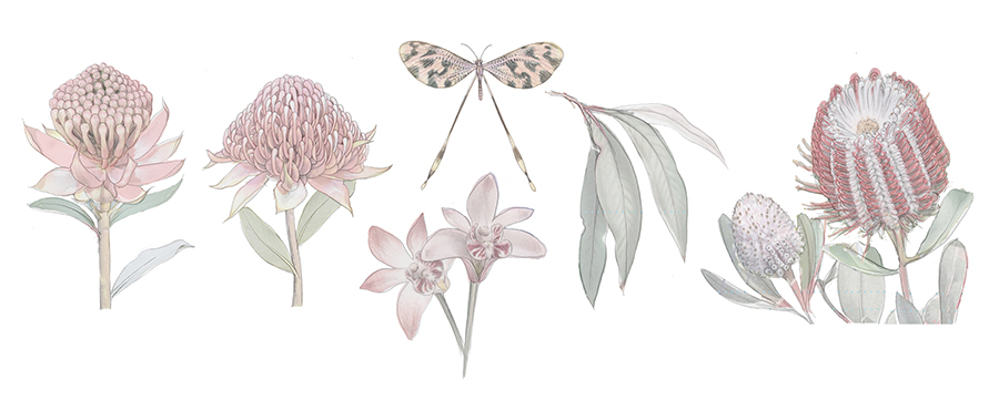
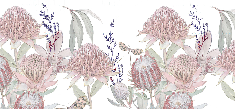
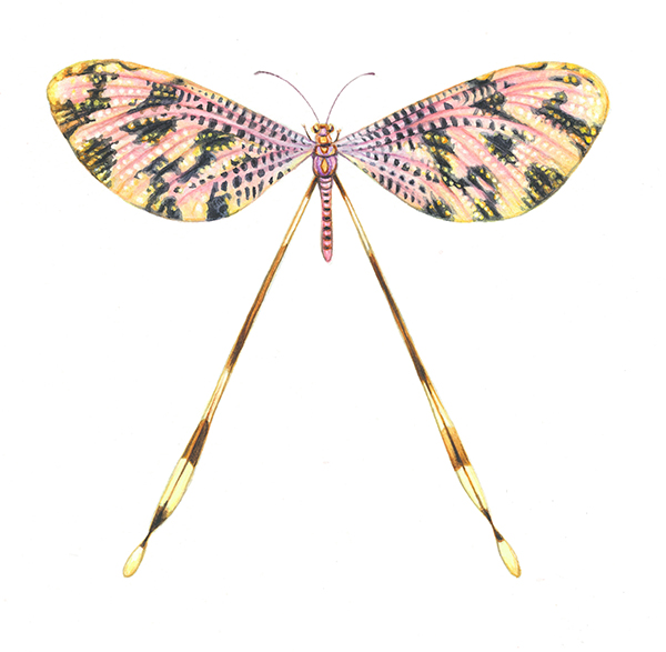
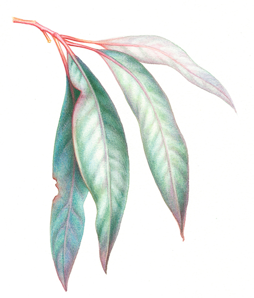 illustration 3
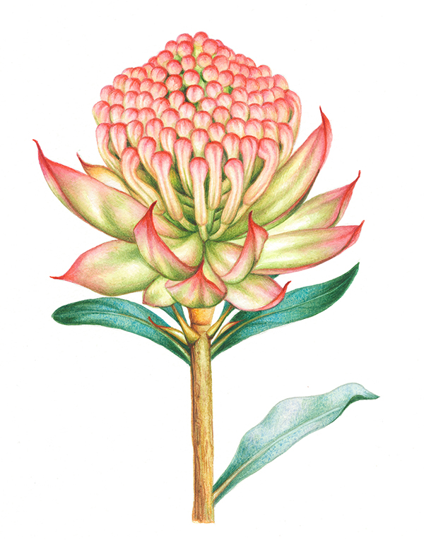 illustration 4
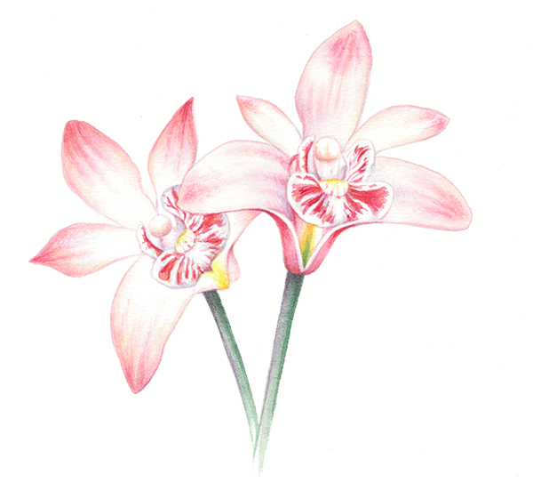 illustration 5
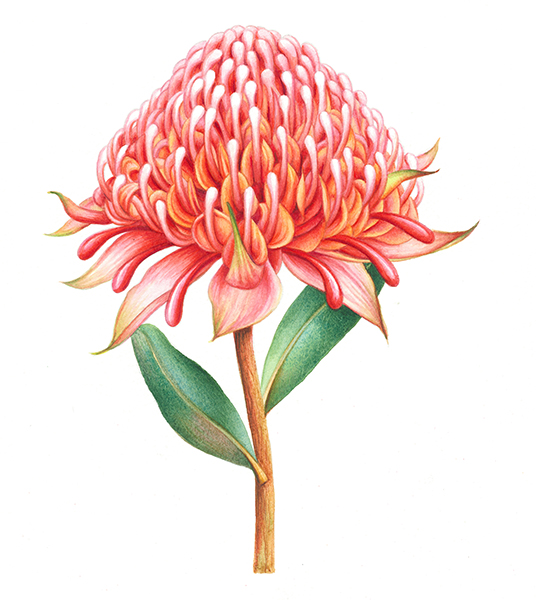 illustration 6